

The symbol represents A of ASUNG GROUP and INFINITY. The shape of INFINITY with smooth curves meets solid A shape to represent stronghold of Asung heading to the global market with its enterprising spirit for the future. Overall shape has a firm bottom and an ascending form, which shows the scale of ASUNG GROUP and its challenging spirit.
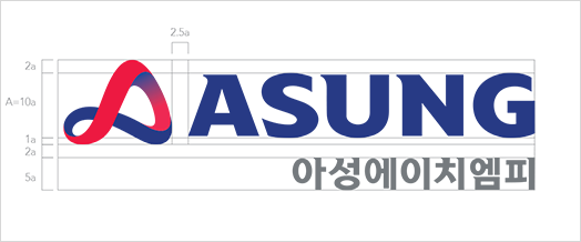
Korean
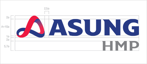
English
RED
PANTONE 200CBLUE
PANTONE 294CDEEP BLUE
PANTONE 281CDARK GREY
PANTONE 877CLIGHT GREY
PANTONE Cool Gray 1CWHITE
Representing the pride as a global trade/ distribution group RED, BLUE
Vital and passionate RED represents ASUNG GROUP's enterprising image
BLUE represents trust and reliable values for the customers.
Representing the pride as a global trade/ distribution group RED, BLUE Vital and passionate RED represents ASUNG GROUP's enterprising image BLUE represents trust and reliable values for the customers.
1988 ~ 1999

2000 ~ 2017

2018 ~ NOW
